When a consumer reaches for a lipstick or serum on a store shelf, their first decision is often driven by color—before they read ingredients or brand names. Warm tones like terracotta and gold, or cool hues such as mint and silver, do more than catch the eye: they tap into deep psychological triggers, address critical pain points like ingredient protection and sustainability, and align with shifting market trends. For beauty brands, mastering the psychology of these tones isn’t just a design choice—it’s a strategic tool to win trust and loyalty.
Warm Tones: Energy, Warmth & Action
Psychology: Evoke feelings of energy, passion, excitement, and optimism. They are stimulating, perceived as friendly, approachable, and grounded.
Brand Signals: Warm packaging often communicates vitality (Vitamin C serums), natural warmth (organic, food-inspired ingredients), sensual pleasure (luxury body oils, lip products), and accessibility.
Consumer Target: Appeals to those seeking a radiant glow, an energizing routine, or products that feel nurturing and earthy.
Cool Tones: Calm, Trust & Efficacy
Psychology: Inspire associations with calmness, serenity, trust, cleanliness, and science. They are perceived as professional, reliable, and efficient.
Brand Signals: Cool packaging is the hallmark of hydration (hyaluronic acid, aqua creams), clinical strength (retinoids, acne treatments), purity (clean beauty, detoxifying masks), and advanced technology.
Consumer Target: Attracts consumers looking for solutions, dermatologist-recommended efficacy, or a sense of cool, refreshing relief for their skin.
Cool Tones as Functional Guardians: Amber, cobalt blue, and green glass are not just cool-toned aesthetics; they are high-performance, light-blocking barriers. By filtering out specific wavelengths of UV and visible light, they directly protect light-sensitive actives like Vitamin C, Retinol, and certain peptides from degradation. This turns a cool-toned bottle from a marketing choice into a visible promise of potency and stability, addressing the consumer’s ultimate fear: an ineffective product.
Client Pain Point Solved: You reassure brands that your packaging actively extends shelf-life and guarantees formula efficacy, reducing returns and protecting their reputation.
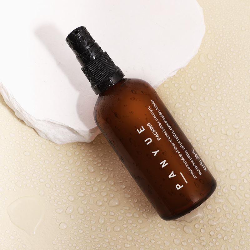
Warm Tones and Perceived Potency: While clear or light-colored warm-toned glass may offer less UV protection, they are ideal for oil-based serums, balms, or foundations where color is part of the product’s identity. The warm hue can enhance the perception of the formula’s richness and natural origin.
Email : hello@panyuepacking.com